It has been a difficult year, and a difficult time to try to run a wellbeing project of any kind. And yet, as lockdown after lockdown has stretched onwards, we need human connection and community more than ever, and so we need projects to foster these connections despite the limits imposed by the global pandemic.
The Museum of the Lost and Found saw us working with 8 groups from across the UK to curate a digital museum, created by the public for the public. This was delivered to each group over a series of five live online workshops, aimed to foster connections between people through the curation of an entirely digital museum, enabling more people to access and engage with archaeological objects through use of 3D scanning technology.

As a 2D animator, I was brought in at the end of the project to help with the creation of a toolkit that would share the expertise and lessons learned from the creation of the museum with others looking to run their own project. We wanted to use the video format to make the toolkit more engaging, using the added tools of visuals and audio that video has to offer. Leigh, the project’s lead, and Karen, the head of the Studio, were also both keen to use a visual style that was warm and inviting, and visually distinct from the usual clean, impersonal ‘corporate animation’ style.
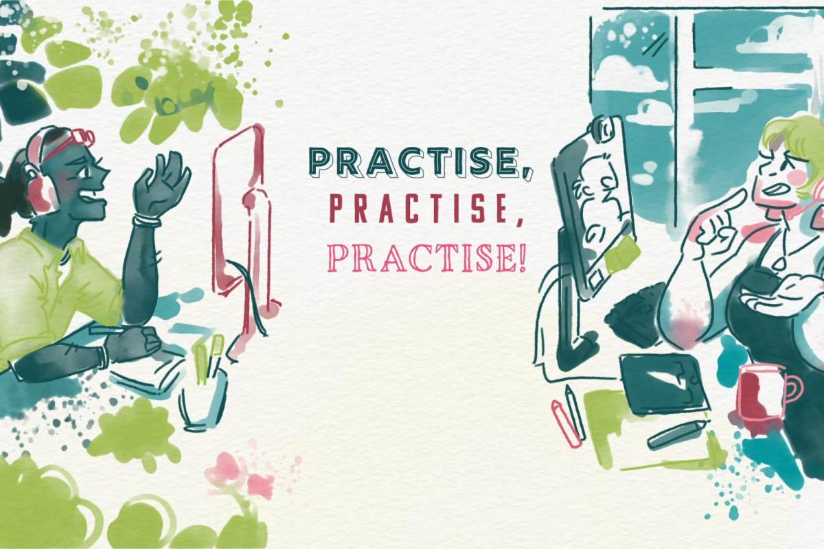
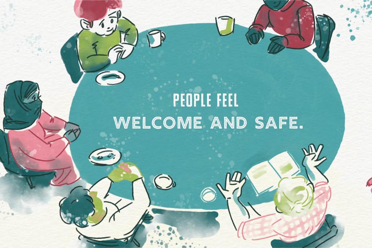
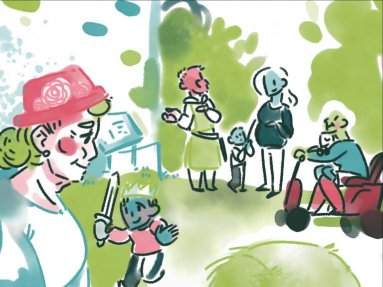
The project’s main constraint was time- animating a five-minute toolkit over three weeks might not sound like a lot to a non-animator, but it was a daunting prospect! To work around this, we came up with a visual style for the toolkit that relied mostly on static illustrations, rendered in a loose, digital watercolour style using a mixture of Clip Studio Paint and Adobe Fresco- and used the time I saved by not having to rig and animate anything to fill the toolkit with as much bespoke imagery as I could create in the time limit! Then I took the paintings into Adobe After Effects and used typography together with a painterly, layered reveal of the images to create some more movement in the video, as well as a watercolour paper texture and a fuzzy distortion that made everything feel more ‘hand-drawn’ to add some more gentle movement to the frame.

If there had been more time for this project, I’d have liked to experiment with adding more 2D animation in this style, using the freedom offered by digital painting to create some loose, painterly animation, or even break out the paints and create some ‘real’ watercolour illustrations, with the unique control over texture, colour and brushstrokes that only a real brush can offer. Although, it was nice to be able to get the watercolour look digitally, and have the painting be instantly ‘dry’ and ready to use, without having to worry about blowing the paint everywhere with a hairdryer or covering every flat surface in my house with drying pages!

I’m very excited to share the final toolkit- although it was definitely more time-consuming to create than a regular toolkit, I feel that it’s a much more engaging way to share Leigh’s expertise and experience running the project, and hopefully, will enable the video to have a much wider reach than a standard toolkit.
A lesson that we can all learn from this project is that there are always creative ways to work around limitations and still create a rich, interesting finished product, and that by aiming to streamline your workflow and being realistic about what you can achieve in a timespan, and focusing on what you can do instead of all the things you might do if you had the time, you might end up creating something that is better than you expect!
Lizzie Garwood
2D Animator


